
By Nichole Fernández (Editor)
Lately I have found myself walking around town, going about my everyday activities, and getting increasingly frustrated. I’m not frustrated with the average worries of modern life such as a busy daily commute, and eternally long bank lines. These things don’t bother me as they are relatively mundane and inoffensive.
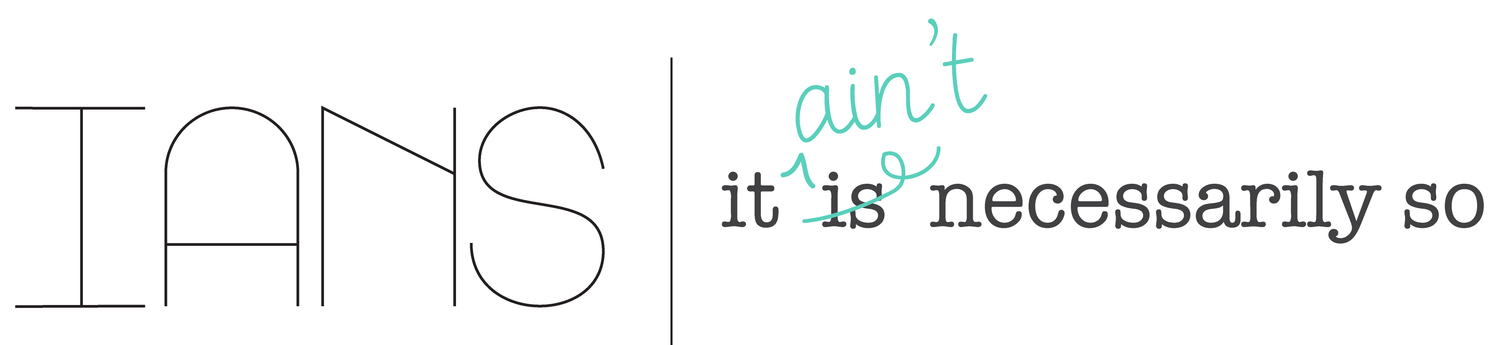
What I am most frustrated by is something that is both rampant and widespread, showing itself all across western world. I’m speaking of course about bad fonts. Yes fonts! And I’m not frustrated in the pretentious way type designers look down on Comic Sans for being too cutesy and inappropriately used. No, I am getting mad at offensive fonts like this one:
And this one:
Also this one:

Alright lets just put them all together:
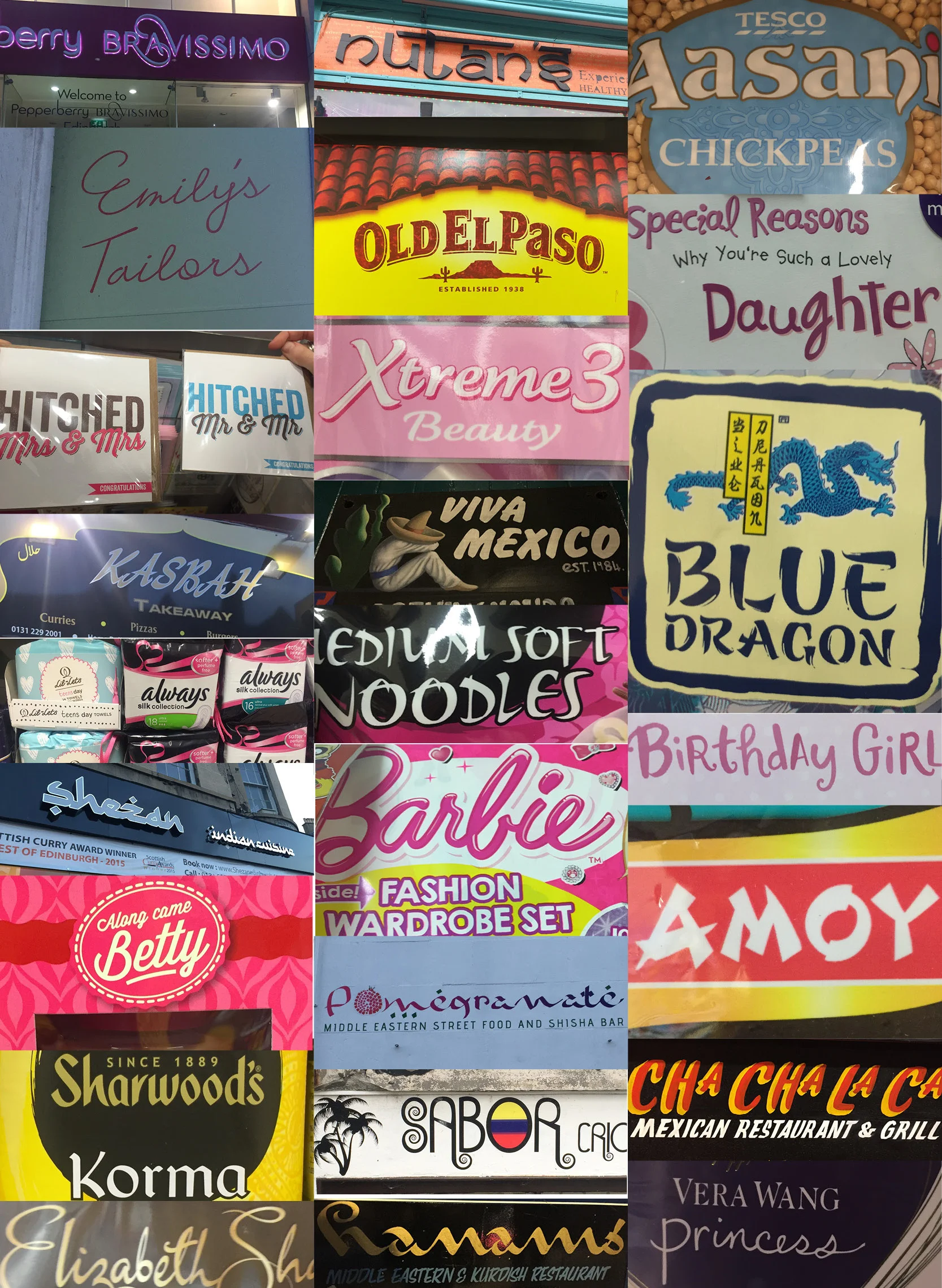
I am fed up with fonts that perpetuate negative stereotypes. This sort of design is seen all over public spaces. It is seen in the gendering of fonts used on the signs of lingerie stores and in greeting cards. It is visible in the appropriation of “Asian” themed fonts on takeout menus. It is inescapable and I take personal offense to it. I really don’t feel that I need to be reminded of my gender stereotypes while purchasing deodorant or a box of tampons.
But these fonts are practically free from scrutiny and widely accepted. While much research in visual sociology has been done on gender and racial portrayals of advertising, almost all of it has focused on images, and not the importance of fonts. And fonts really are just as important after all "typography is what language looks like”[1].
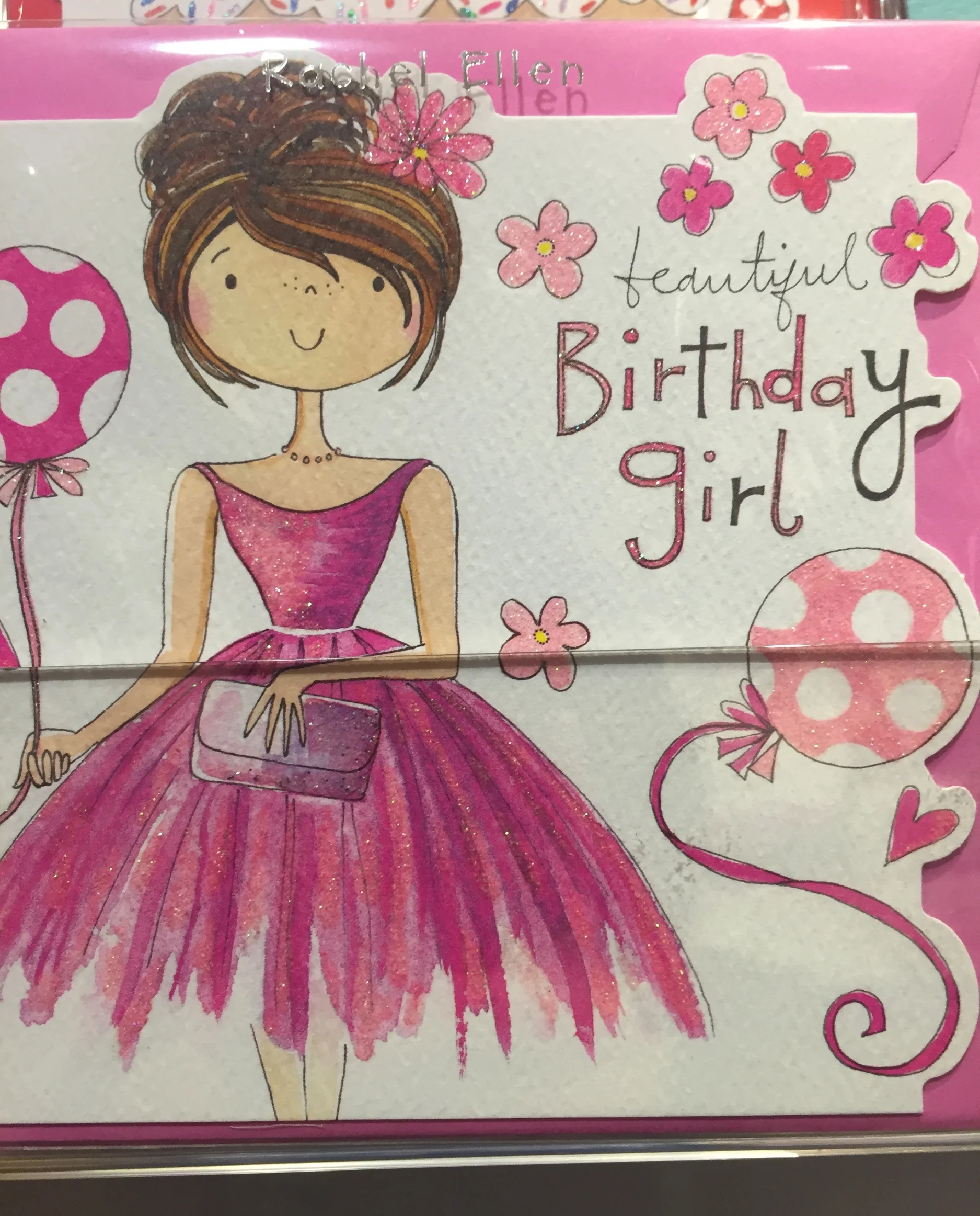
Fonts have personality and use socially recognized symbols to create an alternative visual communication, what Judith Williamson calls a “currency of signs”[2]. For example “feminine” fonts (fonts that are crudely categorized as more appealing for women) tend to be softer, curvy, script based, and sans serif. Whereas masculine is portrayed as its counterpart: bold, square, strong serifs. Now I feel like you can probably see where I am going with this. The use of these fonts not only relies on outdated negative stereotypes about gender, but also reinforces the concept of a strict gender binary. “Stereotypes are a poor choice for describing letters. At best they’re vague and careless, and at worst they’re perpetuating harmful, false ideas about how different genders have innately different capabilities.”[3]. Designers do not subconsciously perpetuate these stereotypes; they are actively used and studied by marketing communicators in order to increase product sales [4].
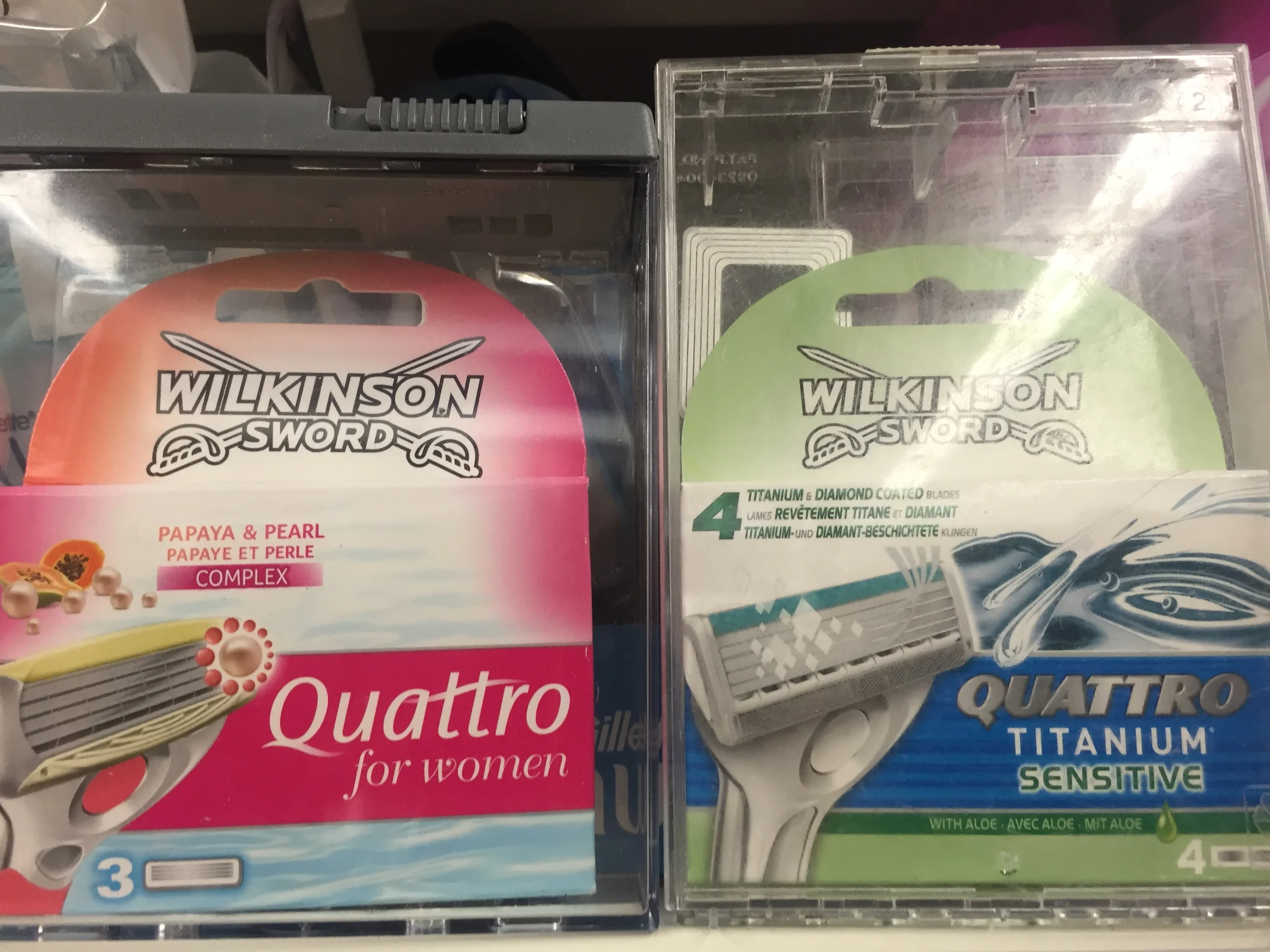
Take the photo below: we have the same brand of razor, one targeted towards men and the other to women, and the font of the razor name, Quattro, is actually changed to appear more “feminine”.
Fonts intended to portray ethnic, national, and racial symbolic recognition are much more varied than gendered fonts. There are fonts that attempt to be Middle Eastern, Mexican, Russian, old English, Catholic, French, African, Thai, and practically every nation, religion, ethnicity, or race you can think of. Sweden even recently released an official national font [5].
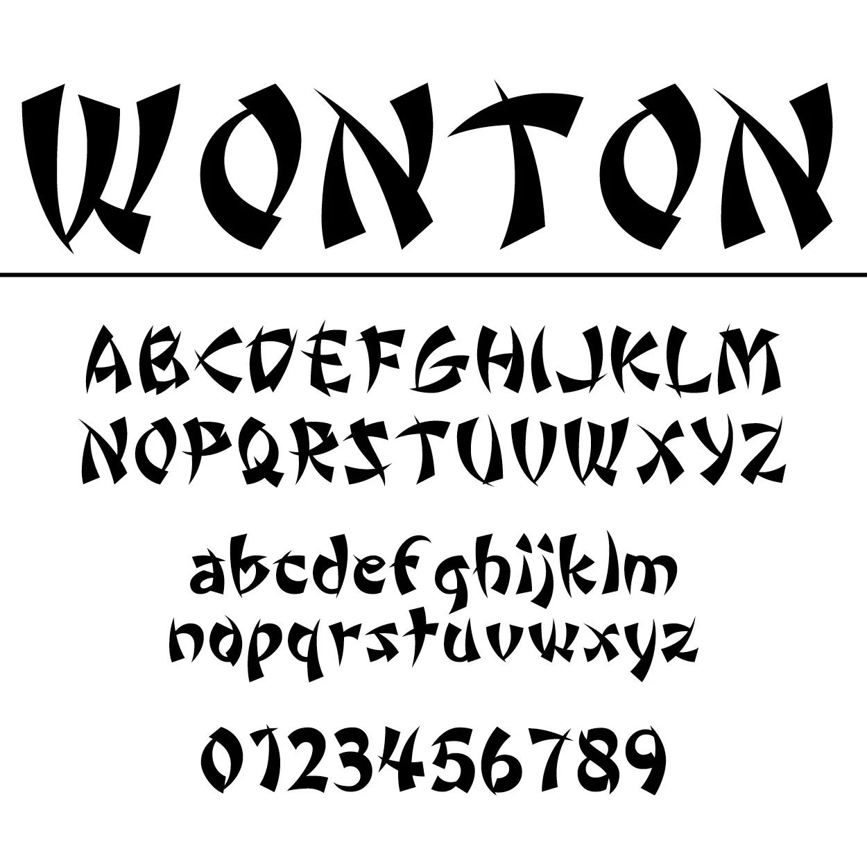
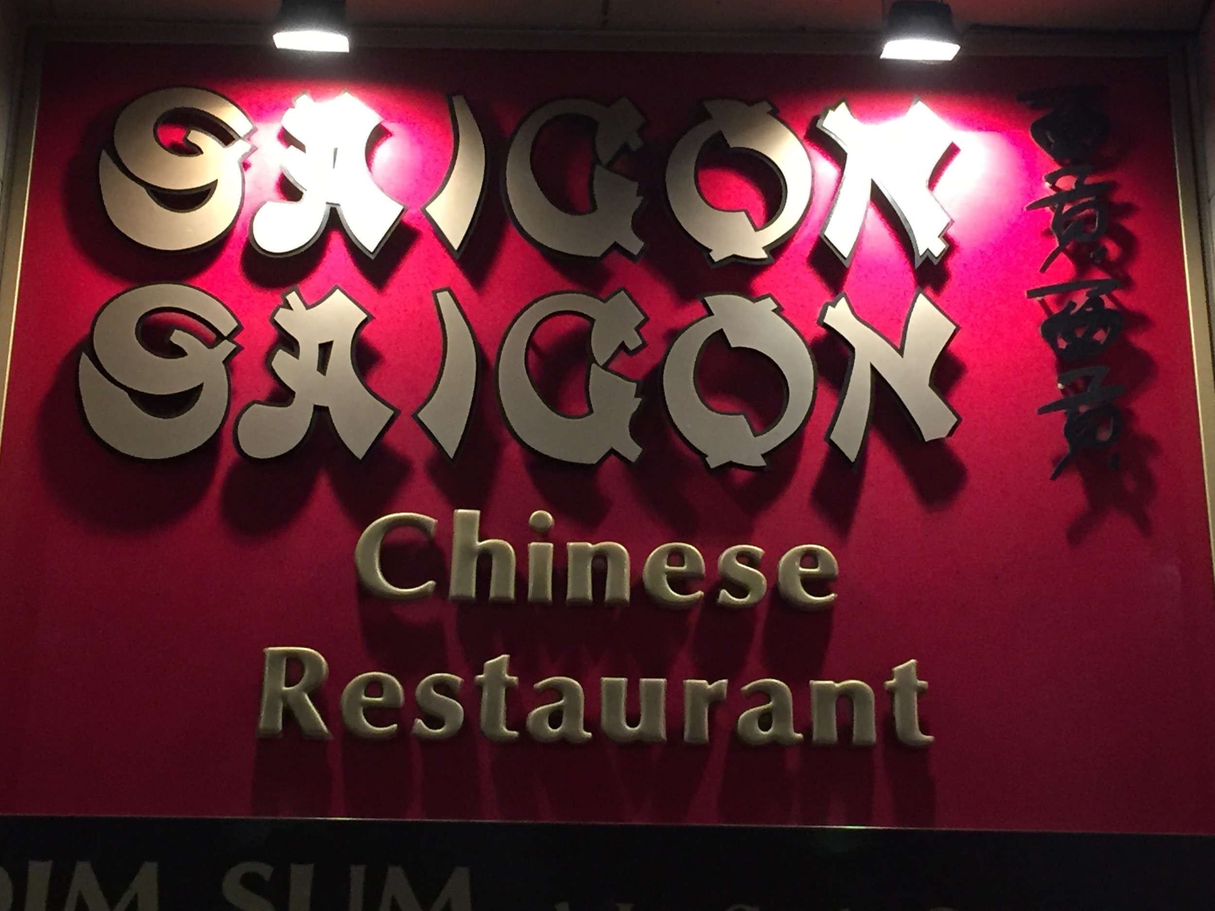
However, more commonly seen are ethnic fonts like Wonton shown here. It is an example of one of the many “Asian” fonts available that are “characterized by curved and pointed wedge strokes that superficially resemble two of the eight basic strokes of Chinese calligraphy […]. Unfortunately, the strokes, forced onto the armature of Roman letters, are assembled in a manner that completely ignores a calligraphic emphasis on structural balance and harmony.”[6] However, as Shaw points out, not all ethnic fonts are based in any real representation of culture. Some fonts just become ethnic by association, and that label becomes inescapable.

But almost all “ethnic” fonts tend to share the same characteristics of being “foreign” or non-western. Ethnic fonts are generally less structured, often handwritten, have purposeful flaws, look old, and can often be based on traditional writing.
Now at this point you may be thinking that I am reading way too much into the meaning of fonts. Ethnic fonts may not seem like such a big deal, and they may not bother you because they are so ingrained in our visual communication. But I feel like this complacency and acceptance of ethnic fonts is one of the reasons why this conversation matters. It matters because it adds to the “currency of signs” that valorizes western aesthetics. It places modern, progressive, industrial, and democratic values to standard typefaces like Helvetica and Times New Roman, while ethnic typefaces allude to the exotic, backwards, wild, and maybe even slightly savage. It is reinforcing a western-centric worldview, and perpetuating socio-economic power dynamics.
Marketing and design students are often taught to consider using things like gender and ethnic stereotypes to their advantage (like in this article here that could really benefit from some feminist help). In this context, they argue stereotypes are not always bad, but rather useful tools to communicate non-verbal ideas, attract the appropriate demographic, and ultimately get people to buy things. In fact, it can be argued that this is an example of how a large amount of what a graphic designer does is simply using these visual stereotypes to their advantage.
It is a common view that fonts are used in this way “for the simple reason that stereotypes, though crude, serve a commercial purpose. They are shortcuts, visual mnemonic devices. There is no room for cultural nuance or academic accuracy in a shop’s fascia. Restaurant owners want passersby (often in cars rather than on foot) to know immediately that they serve Chinese (or Greek, or Jewish) food, and a lettering style that achieves this is welcome.”[7]. It is true that for a designer, it is attractive to use stereotypes as a quick and easy way to get your message across. If your target audience is female, then why not use a curly hand-written font with light pastel colors? Or if you are designing an ad for Jewish matzo ball soup mix, why not use one of the many Hebrew themed fonts? Like the font Faux Hebrew or Hebrewish, maybe even Talmud or Jerusalem, or if you are not yet spoilt for choice there is also a font entitled Circumcision (no joke, you can find it here if you don’t believe me)[8].
While using these visual stereotypes may be an appealing way to design, it is also lazy, bad design. As I write this post I am trying to acknowledge that there is a difference between necessary critiques of the visual social world we live, and just being a mean, pretentious, and overly critical designer. I think it is all too easy for designers to criticize their contemporaries and I try as much as possible to break that trend. But when it comes to font stereotypes I can’t help sharing the same judgmental sentiments as this author: “It is hard to comprehend the brain pattern of the people who choose this font, but it must go something like: ‘How on earth is my audience meant to know that my sign that reads 'Chinese Restaurant' refers to a Chinese restaurant if I don't write it in wacky calligraphy-y, bamboo-y letters?"[9] These sorts of fonts are offensive to the group stereotyped, but also to the viewer. We are intelligent beings with the capacity to read the intent of a sign without designers resorting to negative stereotypes.
For many designers ethnic fonts are seen as simply “garbage fonts”[10] used by “amateur designers”[11]. Using gender stereotypes is also, though much less so, considered an amateur decision. But amateur or not, we go about our day exposed to way more than the rare professional high-end sleek design with a social consciousness. We see these stereo‘types’ everywhere. Maybe it is time we hold designers accountable for these stereotypes. Maybe we should also hold accountable the institutions that teach design without teaching the social implications of design[12]. The job of a designer is not to be uninventive, simply repurposing stereotypes for easy visual communication. We need to call on the design industry to be innovative, creative, and to generate useful visual solutions, because ultimately, that is their job.
[1] Lupton, Ellen. 2010. Thinking with Type. 2nd Ed. New York: Princeton Architectural Press.
[2] Williamson, Judith. 1978. Decoding Advertisements: Ideology and meaning in advertising. London: Marion Boyars.
[3] Rushton, Victoria. September 14, 2015. “Type and Gender Stereotypes”. Alphabettes. http://www.alphabettes.org/type-and-gender-stereotypes/
[4] Grohmann, Bianca. 2014. “Communicating brand gender through type fonts”. Journal of Marketing Communications.
[5] Söderhavet Sweden AB. “Sverige”. http://soderhavet.com/uppdrag/sverige/
[6] Shaw, Paul. June 17, 2009. “Stereo Types”. Print Magazine. http://www.printmag.com/article/stereo_types/
[7] Shaw, Paul. June 17, 2009. “Stereo Types”. Print Magazine. http://www.printmag.com/article/stereo_types/
[8] Helfand, Jessica. June 26, 2007. “Why Is This Font Different From All Other Fonts?”. Design Observer. http://designobserver.com/feature/why-is-this-font-different-from-all-other-fonts/5597
[9] Coville, C. September 26, 2013. “5 Genuinely Offensive Font Choices That Must Be Stopped”. Cracked. http://www.cracked.com/blog/5-genuinely-offensive-font-choices-that-must-be-stopped/
[10] Shaw, Paul. June 17, 2009. “Stereo Types”. Print Magazine. http://www.printmag.com/article/stereo_types/
[11] Simon Garfield. 2011. Just My Type: a book about fonts. Profile Books.
[12] Helfand, Jessica. June 26, 2007. “Why Is This Font Different From All Other Fonts?”. Design Observer. http://designobserver.com/feature/why-is-this-font-different-from-all-other-fonts/5597